The Way Google's Material Design Surpassed iOS Design
Google is a type of search engine that gives the facility of browsing from various devices such as the laptop, mobile etc. Recently, Google developed material design so that it can unify the experienced users to use various Google platforms. The aim of this unification is to improve the overall technological experience of a user by making the interaction easier, simpler and more intuitive. Most people believe that the recent material design plan of Google surpassed iOS design. In the present writing, I will share my thoughts about this issue.
iOS design and Google's material design:
iOS is a mobile operating system manufactured by Apple Inc. It develops an adaptive layout so that your design can work from multiple devices. Two years ago, it has changed its design manual and has made it simple and user-friendly. It allows its designers to focus on animations and function rather than intricate visual details. Here UI or your user interface should be stripped down to the core aesthetic. The present iOS apps ensure perceptible feedback in response to every user's action. As a result, UX or user experience design of iOS develops and improves the quality of interaction between a user and all facets of the company. It's UX design helps to enhance customer's satisfaction and loyalty by improving the usability, ease of use, and pleasure provided by the interaction between the customer and the product.
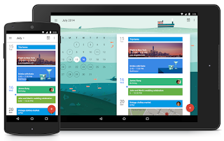
On the other hand, recent Google's material design also helps its users' in various ways. The design of Google aims how Google can improve your life by making their technology smarter. It is said that the material design of Google surpassed iOS design in the sense that it provides more facilities and simple user-friendly attitude. It is not just a new UI rather a whole Google UX. The great features of this new design are-
• Great interaction with various technologies:
One of the main features of any material design is how it interacts with various technologies. The present material design of Google has a very seamless flow between interactions. For example: you are writing a very important article on your laptop but do not finish it and left it open. Don't worry, you can continue this writing from your watches, mobile, tablet or other technological devices because of Google's new material design.
• A seamless information flow between devices and smarter technology:
Another advantage of Google's material design is its quick and seamless information flow between devices and technologies. As a user, you do not need to worry that your messages or files are synced to a device, or you do not need to be bombarded with work emails while you're at home - and vice versa, pictures and text messages sent to you from last night won't be popping up while you're at work.
In short, Google's material design aims to unite Google's expansive product line under a rich set of design styles and principles. It exceeds the design of iOS in various levels. It helps its users to use technology in a very comfortable and homely way.
Category: Android, iPhone, small business, Smartphone


0 commentaires